Land Displacement Monitoring
UX for SaaS

Scope:
UX Design
Year:
2020 - 2022
OVERVIEW
Synspective needed to pivot from a raw satellite data provider to a scalable, high-margin commercial SaaS platform ahead of an IPO, and I was brought in to make that shift work at the interface level.
Mission
Turn a raw data feed into a platform executives would actually buy, ahead of the company's IPO (successfully achieved in late 2024).
The Commercial Tension
Executive buyers held the budgets, but they couldn't read complex scientific charts. I had to turn the interface itself into a sales tool that a non-expert could understand in a single demo.
Target Market
High-value enterprise and government contracts: civil engineering, mining, defense, and sinking infrastructure like Kansai Airport.

PROBLEMS
Engineering-led MVP lacked the clear visual hierarchy needed to convert corporate buyers
Intense cognitive overload separating minor, safe land shifts from active, dangerous structural hazards
Raw, short-term data views completely hid slow, creeping terrain failures that only manifest over months
Assumed users wanted deep, raw variable controls; customer feedback proved they needed automated, pre-interpreted anomaly alerts
MY ROLE
I was the sole product designer on this project for a long time (until a UX researcher joined) leading the strategy, UI architecture, and creating modular templates. At the same time, I had to manage regular alignment loops between satellite engineers, front-end developers, and sales managers. Weekly design-engineering frameworks helped the team translate data science into a complex yet approachable UI.
DIRECTION
I reframed dense satellite radar data into a three-tier risk-alert dashboard, balancing rapid executive overviews for buyers with advanced filter parameters for deep investigations.
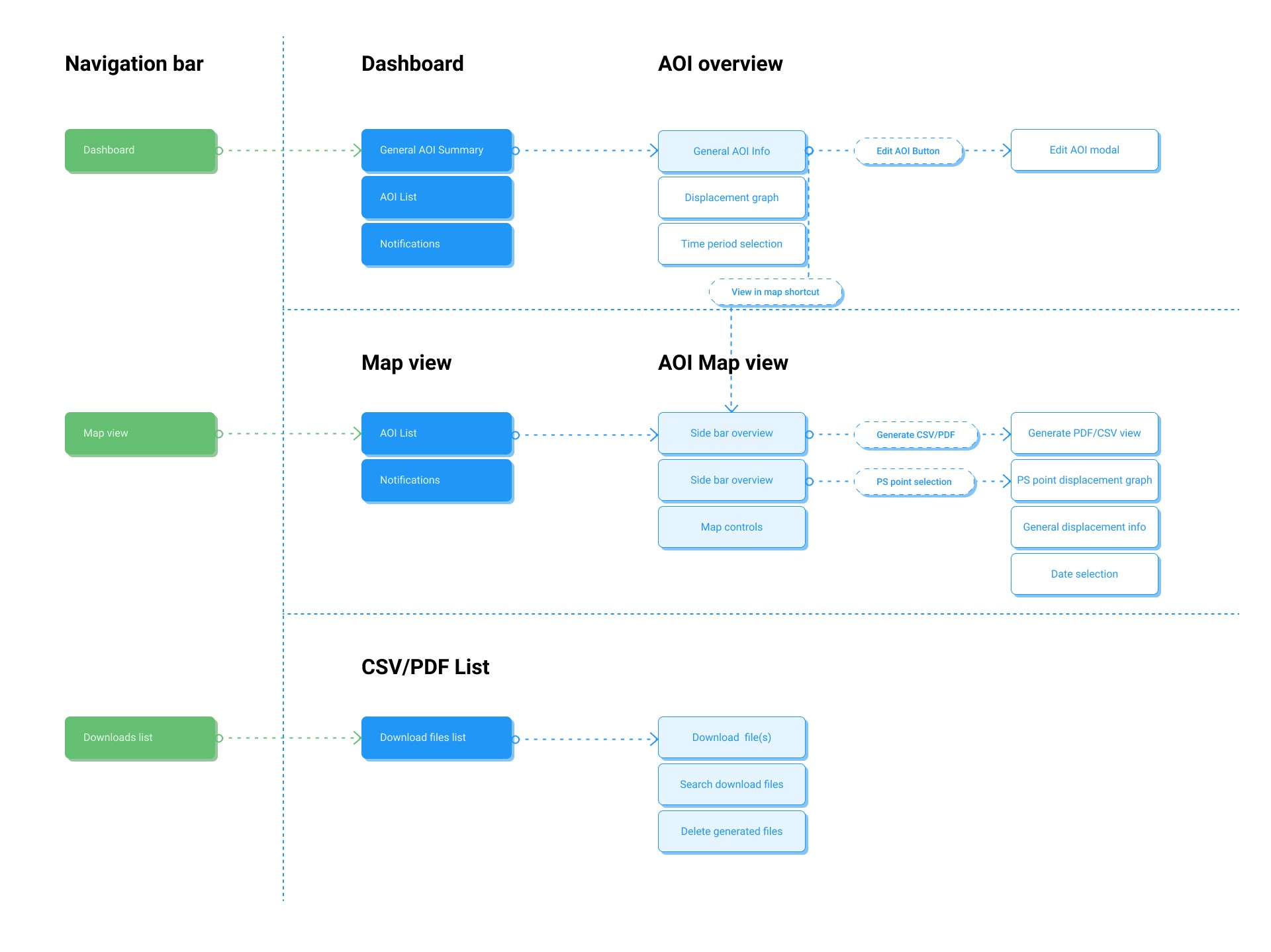
The information architecture map allowed me to align developers, engineers, and myself about the overall structure of the product and what elements we want to show and how these are connected logically inside the product since a lot of the processed data is relatively complex.

Dashboard and map view wireframe: this layout helped us discuss where we highlight crucial information and critical interaction points
SOLUTIONS
The Traffic Light Hierarchy
This is what fixed the visual-hierarchy and cognitive-overload problems at once. I abstracted raw millimetric variations in land displacement into three clear algorithmic states: Green (stable), Yellow (inspect), Red (urgent action). A non-technical buyer could now read risk in seconds, while engineers kept full control over the backend thresholds driving each state.

Designing Around Temporal Gaps
This solved the hidden-failure problem: short-term views were masking slow, creeping terrain shifts that only show up over months. I addressed the natural delay between satellite flyovers by introducing an interactive historical increment selector, so viewing data over weeks or months surfaced structural settling that a single snapshot never would.

Technical Pragmatism
Shipping the hierarchy above meant working within real engineering constraints, not around them. I partnered with engineers to reshape the map-drawing tools around rigid code limitations, protecting the launch timeline without watering down the user experience.

Strategic Design Library Leverage
The automated, pre-interpreted alerts users actually wanted (rather than the raw variable controls we'd originally assumed) needed to ship fast. Adopting IBM's open-source Carbon Design System meant I could skip reinventing basic components, build immediate trust with front-end developers, and get fully functional prototypes in front of users faster.
OUTCOMES
Unified Design Framework
Turned the custom map layouts and data components into a shared design system. This created a consistent UI across parallel SaaS products and cut down on redundant layout work for other internal teams.
Accelerated Prototyping for Sales
Having a ready-to-use component library enabled product teams to build interactive, high-fidelity sales demos in days instead of weeks, making it much faster to pitch to new enterprise clients, which was crucial to attract more business and allow the company to secure more fundings.
Clearer Risk Analysis for Engineers
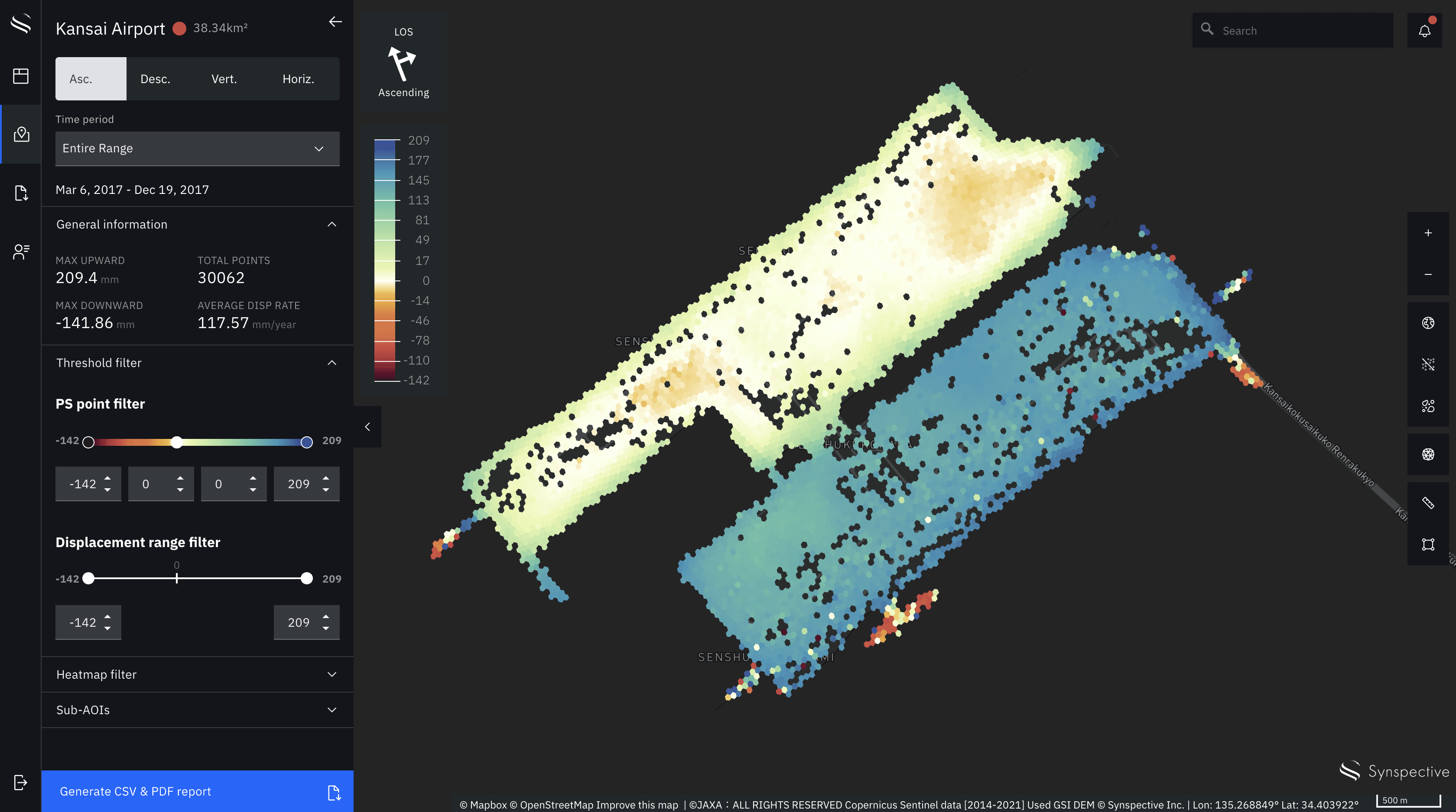
Simplified complex satellite data by introducing a dedicated timeline and millimeter threshold filters. This allowed civil engineers to track land displacement and spot structural risks quickly without getting overwhelmed by dense information, making Synspective the go-to alternative for approachable yet complex SaaS products.

LEARNINGS
Designing for Data Reality
In highly technical products, you can’t design under the assumption that the backend works instantly. Because handling heavy satellite data comes with real API limits and processing delays, I learned that the UX has to actively manage those latencies. That means using clear loading states and data-freshness indicators so the software never feels broken to the engineers using it
Knowing When Not to Build From Scratch
When project timelines are incredibly tight, a designer's value isn't in drawing custom buttons or dropdowns. Choosing to use an established framework like IBM Carbon allowed us to completely skip the visual design debt and focus 100% of our energy on the actual problem: making complex map layouts and timelines easy to read. This left me and the team plenty of time to work on technical feasibilities and the overall user experience.
Embracing Data Density for Specific Users
This project taught me that standard UX advice about keeping interfaces "clean" and full of whitespace doesn't always apply to expert tools. The civil engineers checking for structural risks didn't want a minimalist dashboard; they needed a high density of information visible at once. The goal wasn't to hide data, but to organize it logically through proper filtering.