Global Geospatial Index (GGI) Platform
UX for SaaS

Scope:
UX Design
Year:
2022
OVERVIEW
Synspective builds advanced satellite and geospatial mapping technology. The sales team was struggling to get traction with the first version of their index mapping platform because it was too dry and technical. Over a six-month timeline, my team was tasked with finding out why the initial platform failed, identifying the right target audience, and redesigning the entire experience to make complex mapping data highly accessible.

PROBLEMS
Overwhelming Interfaces
Non-expert users like real estate planners and investment managers felt completely overwhelmed by the raw index data. They found it difficult to extract reliable answers for their specific business needs.
Low Engagement
The original platform was built as a basic functional viewer where users could only look at raw index maps over a selected area, giving them very little reason to stick around.
Highly Technical Workflows
The service relied on incredibly complex data pipelines and algorithms. The challenge was finding a way to simplify the interface without watering down the deep analytical tools that data scientists required.
MY ROLE
I was a solo UX designer on a cross-functional team that included a UX researcher, engineers, data scientists, and a marketer. I co-led our research phase by running discovery workshops with our internal applied scientists to understand the technical limitations of our data. From there, I mapped out user journeys, built the new information architecture, created lo-fi storyboards to align the team, and designed the final high-fidelity user interface. I also designed a targeted beta landing page to attract and screen our initial testers.
DIRECTION
We shifted the platform from a passive data viewer into a structured project workspace. The new direction split the application into two distinct user flows so data experts could customize complex datasets while non-experts could easily search, filter, and visualize geospatial index layers for their own use-cases and business plans.
SOLUTIONS
User Storyboarding
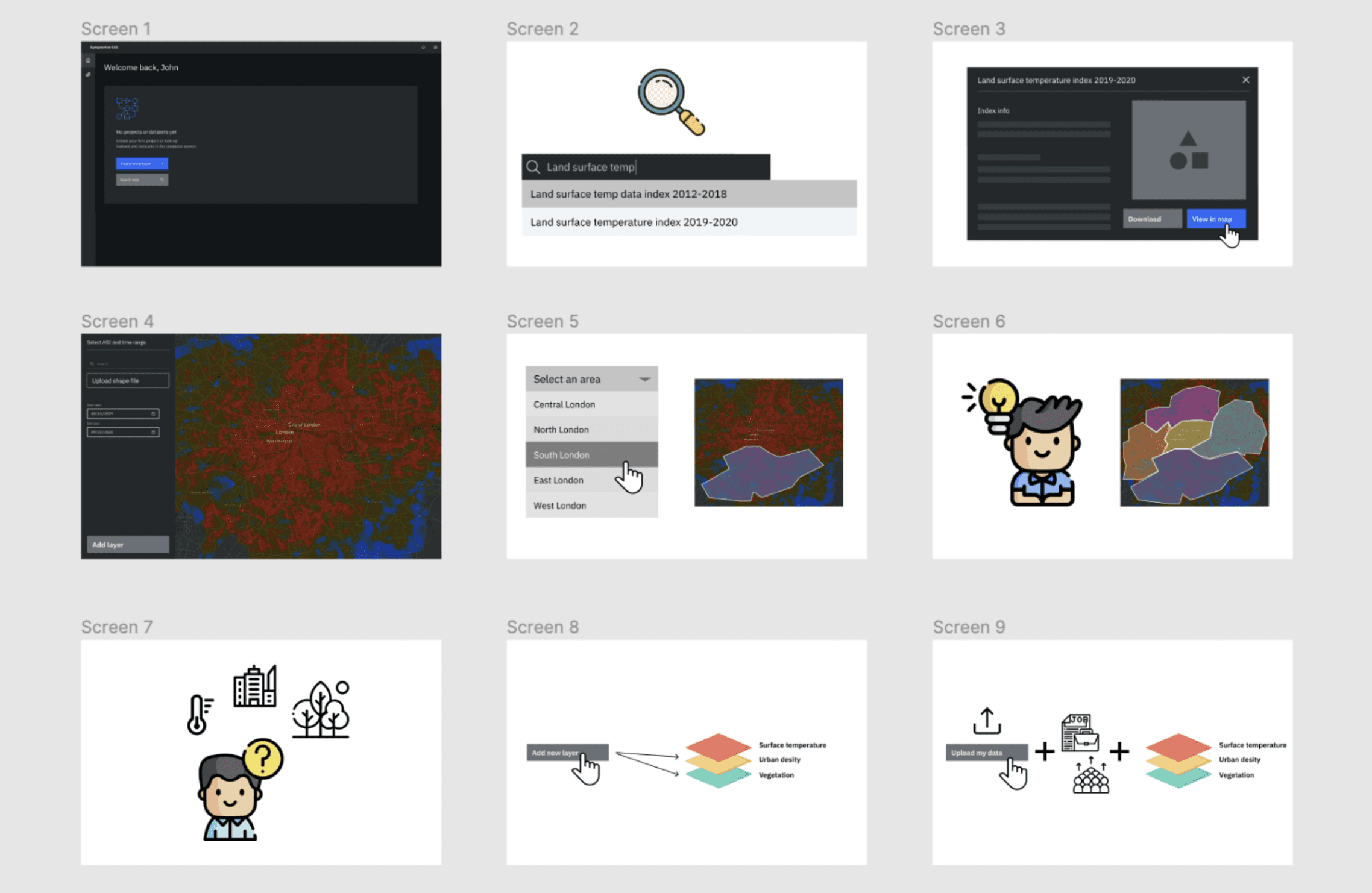
This tackled the low-engagement problem head-on. I built step-by-step storyboards to map and test key interaction points with potential customers before a single line of code was written. Walking stakeholders and developers through the flow this way confirmed our core value proposition early, instead of discovering it didn't land after launch.
Contextual Project Dashboards
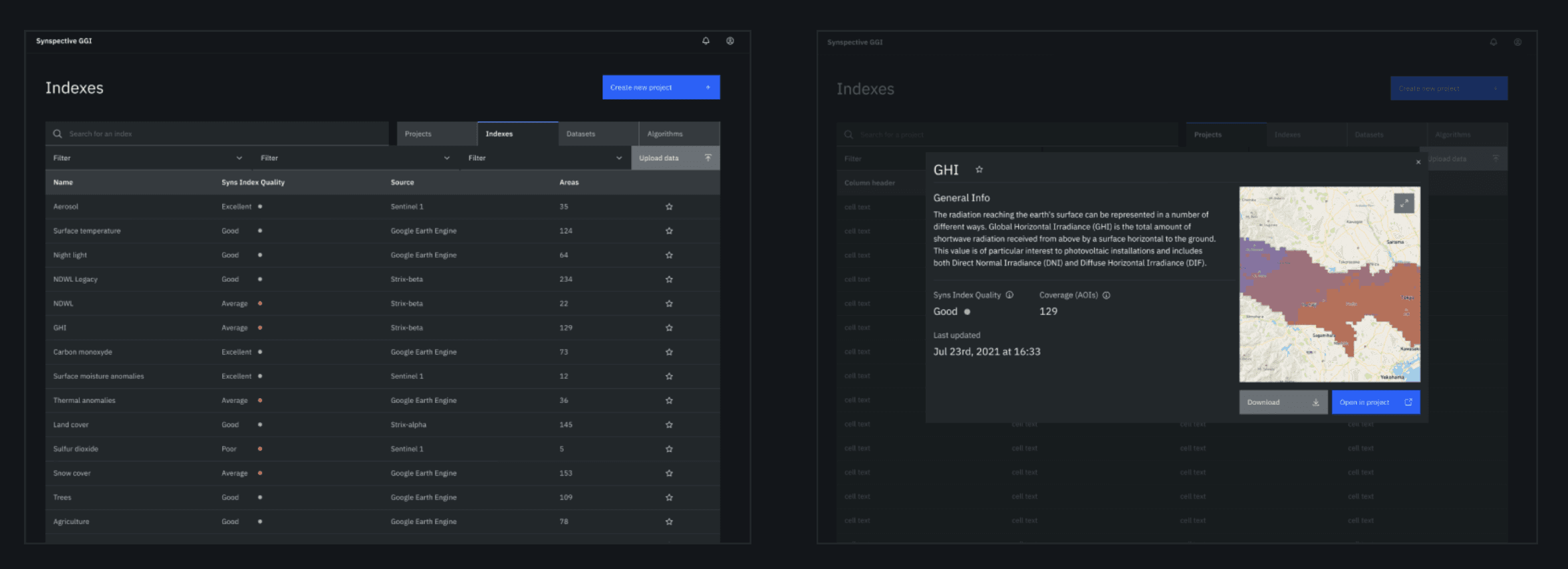
This is what turned the platform from a passive viewer into something worth returning to. I designed a main workspace where users organize their maps by project, view saved index tables, and manage custom data parameters in one place, giving them a reason to come back beyond a single lookup.

Simplified Search and Info Modals
This directly addressed the overwhelming-interface problem for non-expert users. I built an intuitive search with clear suggestions, plus simple descriptive modals explaining what complex indicators, like Global Horizontal Irradiance (GHI), actually mean before a user adds one to a map. Experts still had full access to the underlying complexity; everyone else got a plain-language on-ramp.
Technical Pragmatism
Same approach as the risk-monitoring platform: I partnered with engineers to work within real code constraints rather than around them, and adopted IBM's Carbon Design System to skip rebuilding basic components from scratch. See the Land Displacement Monitoring case study for the full story on that decision.
Strategic Design Library Leverage
Adopted IBM’s open-source Carbon Design System. Utilizing a thoroughly documented framework bypassed component creation overhead, built immediate trust with front-end coders, and rapidly expedited fully functional prototypes.
OUTCOMES
A Shared Visual Language
I codified the visualization patterns and core page layouts from this project into the organizational standard, so other product teams didn't have to solve the same layout problems again from zero.
Faster Path from Idea to Demo
With a working component library already in place, product teams could sketch, prototype, and scale new SaaS products directly from this foundation, cutting the distance between an idea and a working sales demo.
LEARNINGS
Pragmatism Over Purism
Good UX design in technical sectors means adapting visual aesthetics to the needs of both engineers and users alike when necessary to align with live backend processing latencies and API constraints.
Systemic Execution
Using an existing design system like IBM Carbon over building a custom UI kit preserved our tight launch window and focused our efforts entirely on information architecture and usability.